The lights reach across
A few small ones: the Christmas lights hang all the way across, and putting your own domain on Station is clearer.
Reply, right under a post
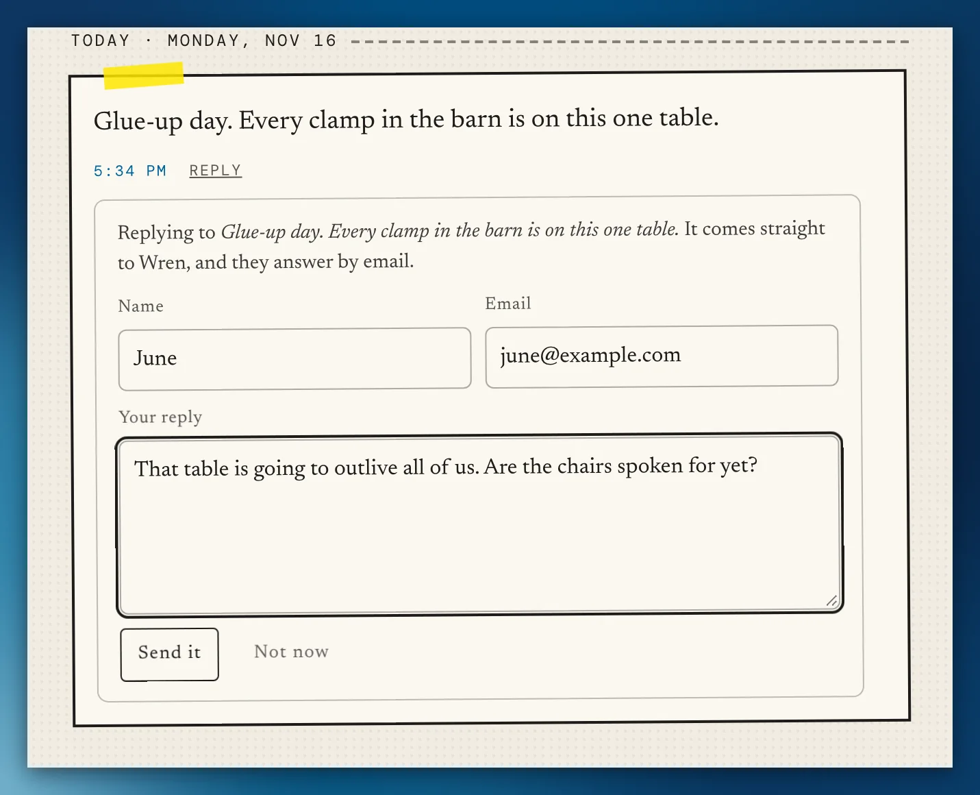
Every post on a stream, its own page and the frequency has a quiet Reply. It opens a small form under the post, and the note goes to the person through their Write to me door, saying which post it's about. They answer by email. No threads and no counts, and with Write to me off, there's no Reply.
Zine, for your page
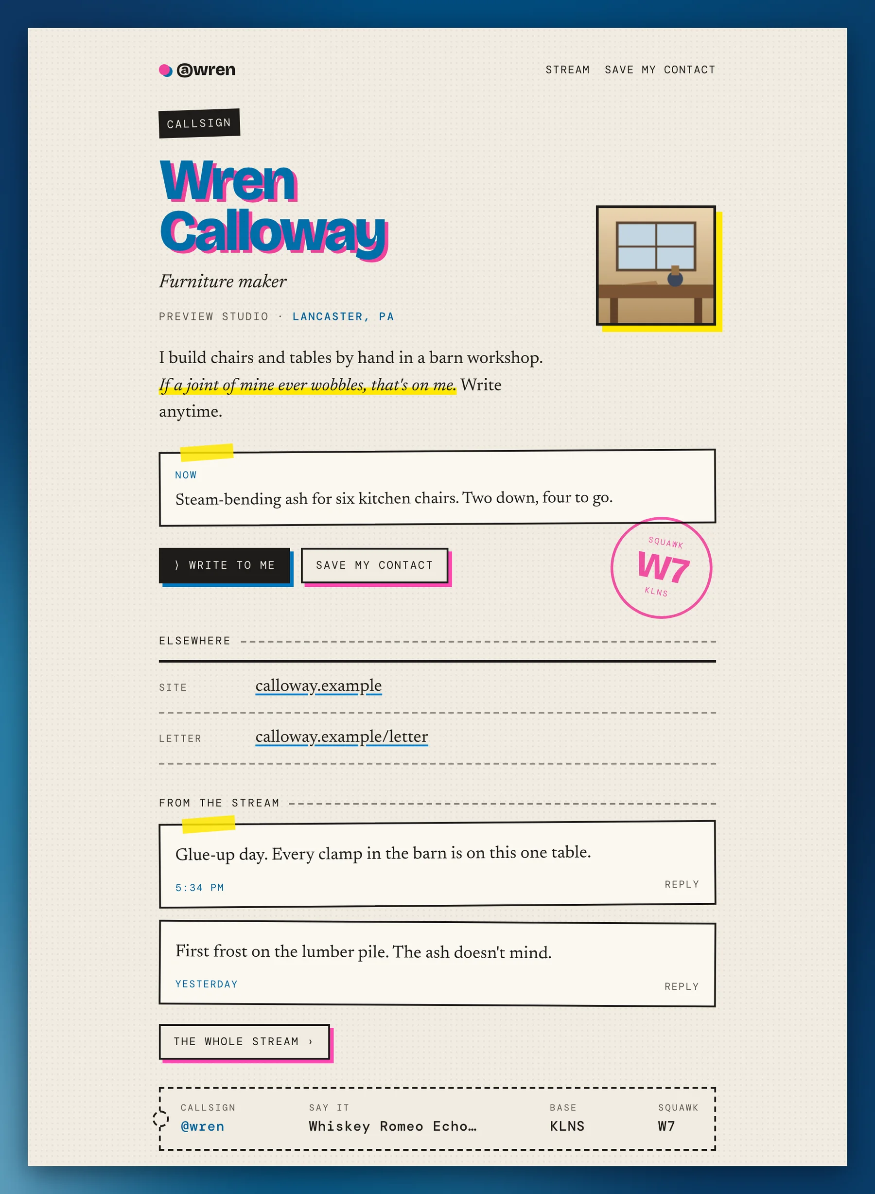
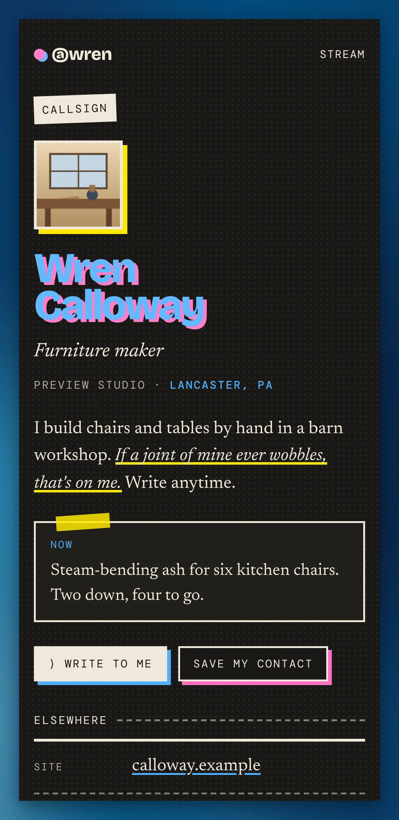
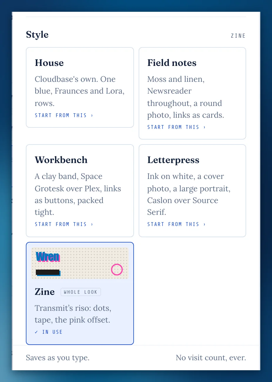
A fifth look in Edit my page › Look: Transmit's riso, with dots, tape and the pink offset. Your name becomes the headline, Write to me opens in place, and night follows your reader's device. Your dials rest while you wear it and come back as they were. Your stream follows it too.
A Zine placard
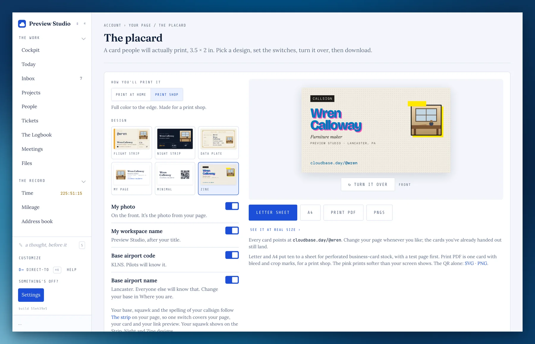
The placard has a Zine design for everyone: the name with its pink offset, the photo on a yellow block, the QR in a framed box. It prints at a shop, at home, or in one ink. The pink prints softer than your screen shows.
A week that starts on Sunday
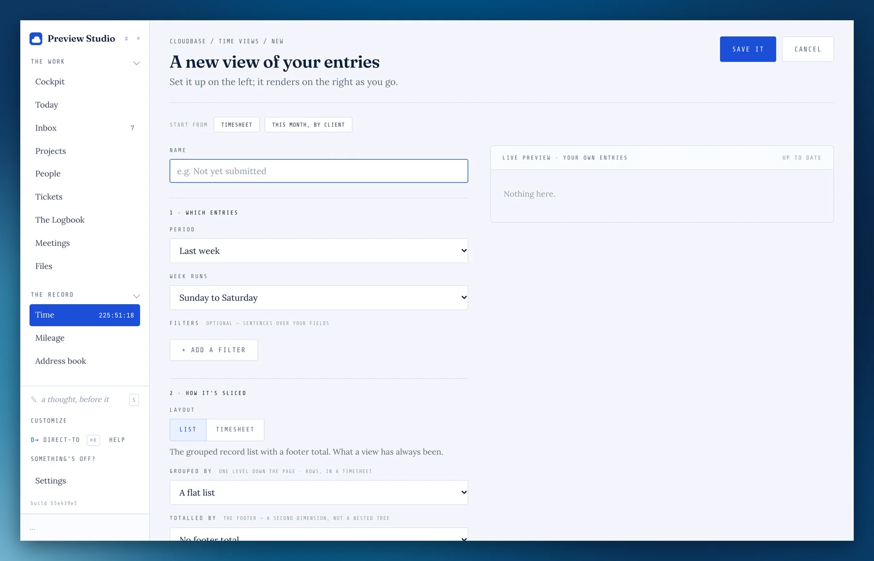
A Time view's This week or Last week can run Sunday to Saturday. Pick it under Week runs, and the timesheet's columns and totals follow.
Your own domain, without the www
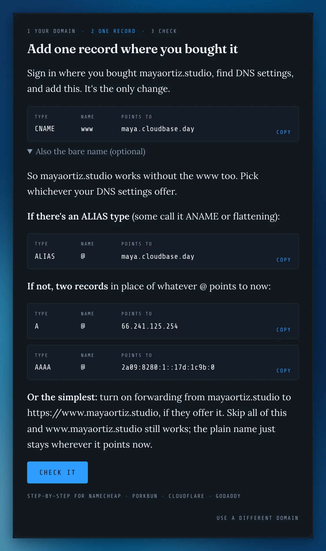
The domain sheet now spells out all three ways to make the plain name work too: an ALIAS record, two address records, or your registrar's forwarding. Skip it and the www address still works.
Copies out, on the runway
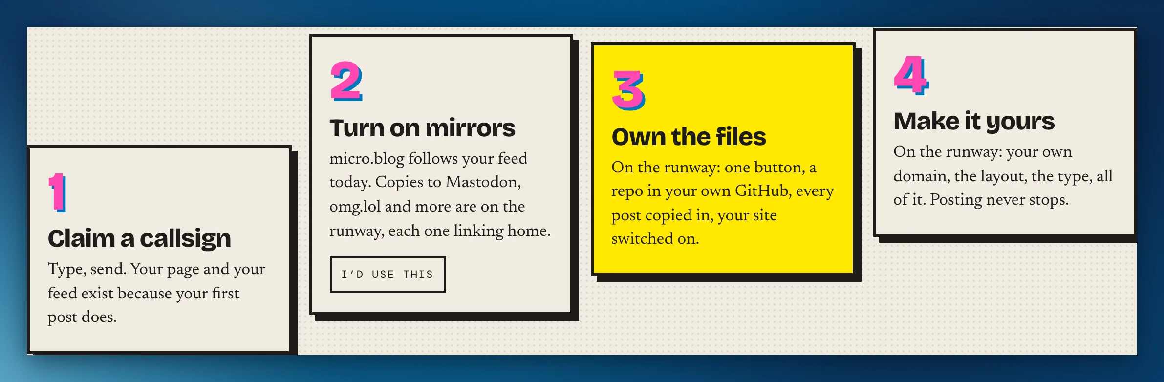
Want your posts to go to Mastodon, omg.lol and the like too, each one linking back to your stream? Say so with I'd use this on the Transmit page or under Your stream. It helps me decide what to build next.
Alt text, written for you
With the Assistant on, a picture's description is written the moment it goes in: pasted into the Logbook, added to a post, your page's photo, a photo in your Station's gallery, an image in release notes. It's yours to read and change before anything goes out, and words you wrote yourself are never replaced.
Photos at night
In dark mode, photos on your stream, its posts and your page sit a little warmer and dimmer, so they don't glare, and come back to full color when you point at them.
Now, where you want it
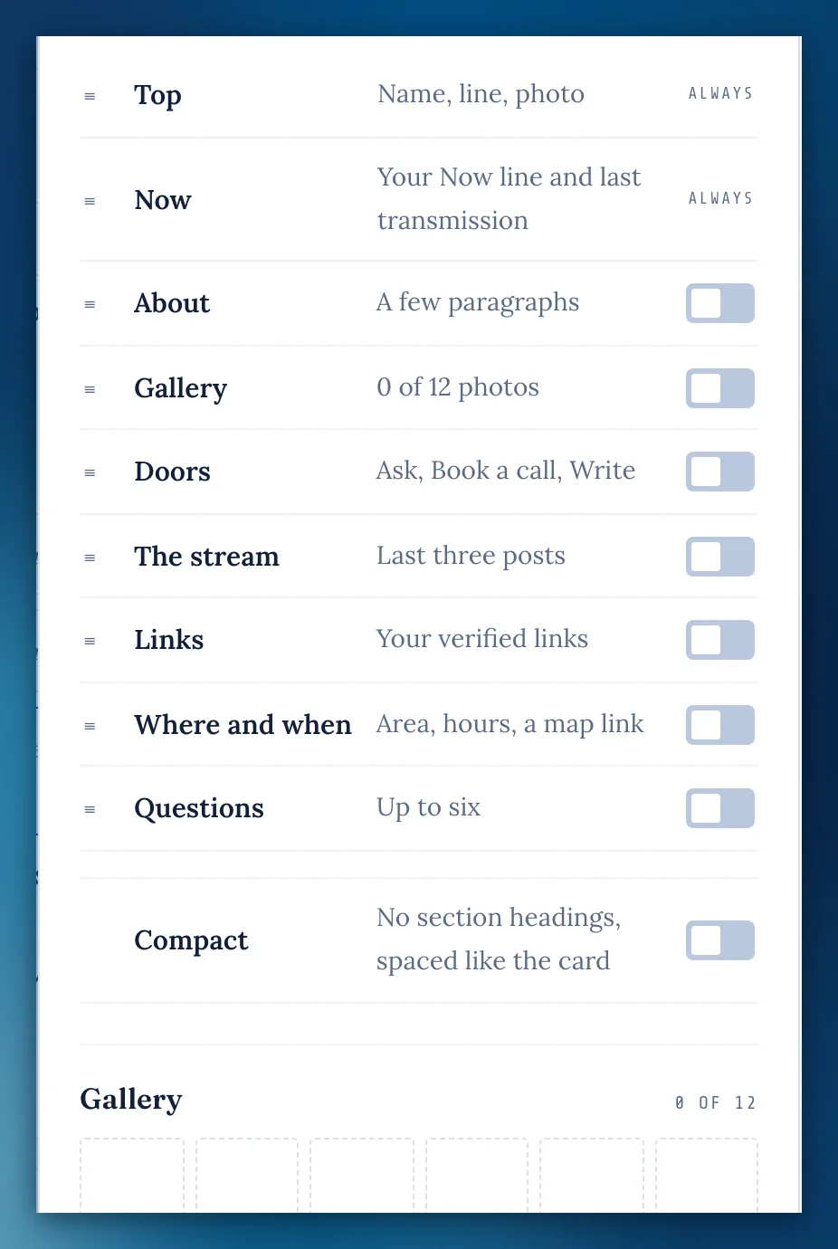
In Edit my page › Sections, Now (with your last transmission under it) is a row of its own. Drag it anywhere on the page. It's always on, and it stays right under the top until you move it.
Sections move like tasks
Pick up a row in Sections anywhere but its switch, and it moves the way a task does: it fades where it was and the list makes room. The arrow keys still work.
Compact
A switch under Sections drops the section headings and spaces your page like the card. On Squawk, your links go back to the card's full-width rows.
Meeting links say where
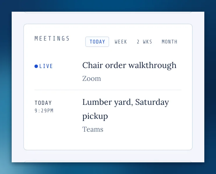
A meeting whose place is a Zoom, Teams or Google Meet link now reads "Zoom" (and so on) on the Meetings card and board instead of running off the edge, and the meeting has a Join button. A link is never offered as a trip to log.
You can see what you type in "+ a version"
On a flight, the box for a version or a date opened as a sliver. It's full width now.
The domain sheet stays open
In the full app, pressing Next or Check it closed the domain sheet and sent you back to your room. It now stays on the step you're on.
Your name shows as you type itFrom beta feedback
On a Christmas Saturdays link, in dark mode, the name box was white and so were the letters, so it looked like nothing went in. It follows your phone's light or dark now, and so do the movie box and the Share sheet.
Pictures in flight notes get their description
With the Assistant on, an image added to a flight's release notes now gets its description written as it goes in, whichever workspace you set the Assistant up in.
The lights reach across
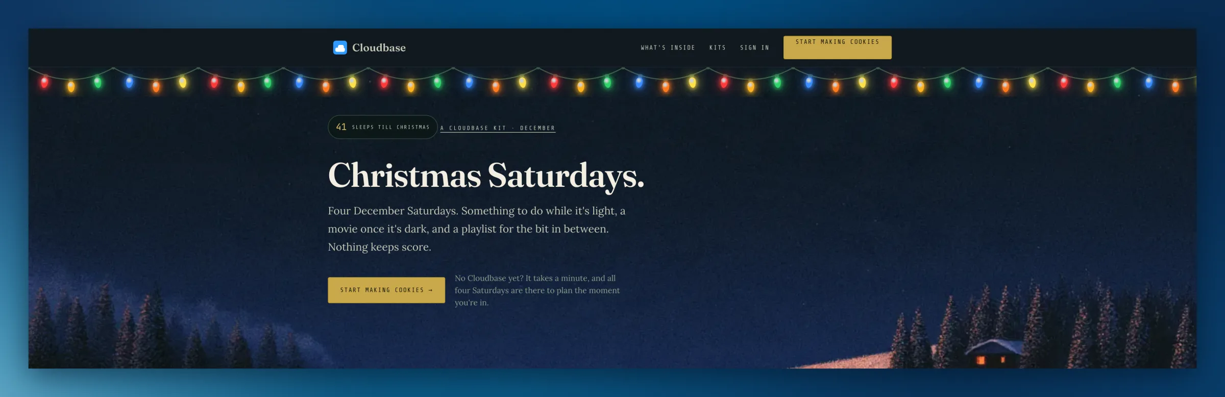
On a wide screen the Christmas lights stopped partway; now they hang edge to edge on the Kit page, the Kits page, Today and your phone.
Missing something, or found something off? It reaches me directly.
⟩ Write to Aaron